Colors have a profound impact on our emotions and behavior, making them a powerful tool in interior design. Understanding color psychology can help you create spaces that evoke the desired mood and atmosphere. This article explores how to use color psychology effectively in your home.
1. Warm Colors for Energy
Colors like red, orange, and yellow are energizing and can stimulate conversation and activity. They’re ideal for social spaces like living rooms and dining areas.
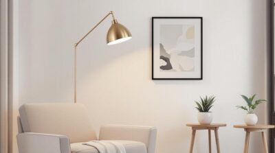
2. Cool Colors for Calmness
Shades of blue, green, and purple promote relaxation and are perfect for bedrooms and bathrooms.
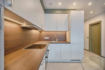
3. Neutral Colors for Versatility
Neutral tones like white, beige, and gray provide a timeless backdrop and can be paired with any accent color.
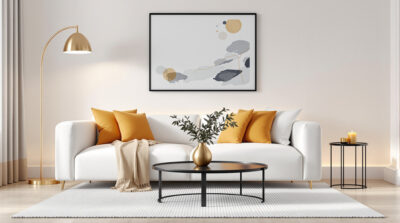
4. Bold Colors for Statement Pieces
Use bold colors sparingly to create focal points, such as an accent wall or a piece of furniture.
5. Consider Room Function
Choose colors based on the room’s purpose. For example, use calming tones in a home office to enhance focus and productivity.
6. Balance and Contrast
Combine light and dark shades to create depth and visual interest. Avoid using too many colors in one space to maintain harmony.
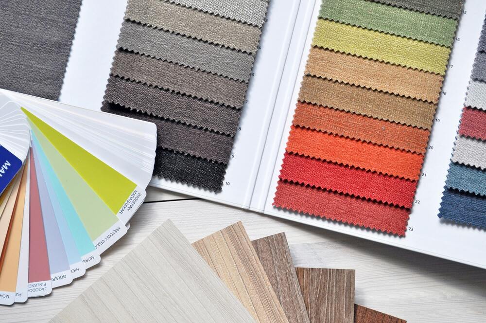
7. Test Before Committing
Always test paint samples on your walls to see how they look in different lighting conditions.
Conclusion
Color psychology is a powerful aspect of interior design that can transform the look and feel of your home. By understanding the emotional impact of colors, you can create spaces that are both beautiful and functional.